Coworking Spaces
Print and Mail Colour Palette for Coworking Spaces
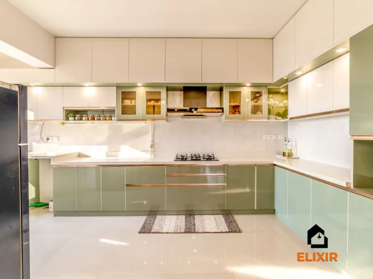
Choose colour against the surfaces that will stay. Test it on a large sample at the room's brightest and darkest points.
Explore the ideas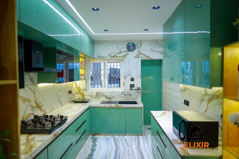
Compare the options
- Set the brief
- Collect samples of permanent finishes, upholstery and hardware before picking a paint or laminate.
- Compare
- Assign a background colour, one wayfinding or feature colour, and contrast where people need to distinguish edges.
- Before buying
- Check painted or laminated samples vertically beside the same light source the finished room will use.
Worked example
A powder room has no window, and a chosen dark tile makes the small vanity area feel visually compressed.
Test tile, grout, and paint together under the planned fixture rather than relying on showroom light. Keep the strongest contrast on a selected feature and preserve clear visibility around basin edges.
How to test it
Compare the samples in daylight and artificial light, and check that handles and door edges remain easy to distinguish.
Apply it to this space
- Layout
- Locate print and mail functions together on a service edge, outside quiet desk and call routes.
- Detail
- Include paper storage, sorting counter, recycling, and a parcel shelf with clear labels.
- Trade-off
- Central placement is convenient but can disturb more members.
- Test queueing without blocking a corridor
- Check printer access and paper replenishment
The Elixir portfolio
Details worth a closer look