Offices
Open Workstations Colour Palette for Offices
Choose colour against the surfaces that will stay. Test it on a large sample at the room's brightest and darkest points.
Explore the ideas
Compare the options
- Set the brief
- Collect samples of permanent finishes, upholstery and hardware before picking a paint or laminate.
- Compare
- Assign a background colour, one wayfinding or feature colour, and contrast where people need to distinguish edges.
- Before buying
- Check painted or laminated samples vertically beside the same light source the finished room will use.
Worked example
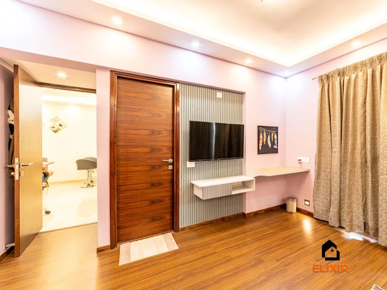
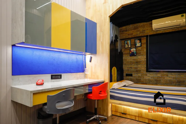
Imagine a study nook with a dark screen, white desk and pale wall that feels visually harsh during long reading sessions. The user also needs to distinguish controls quickly.
Test a softer wall sample beside the desk and screen rather than selecting it from a swatch alone. Retain clear contrast on switches, shelf edges and storage labels, checking them under the intended task light.
How to test it
Compare the samples in daylight and artificial light, and check that handles and door edges remain easy to distinguish.
Apply it to this space
- Layout
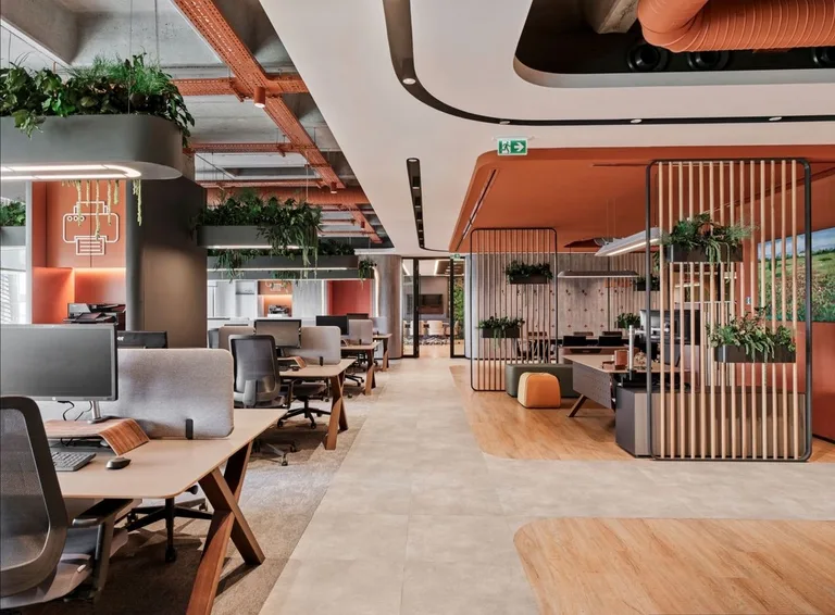
- Arrange desk rows with a distinct aisle and keep high-traffic routes behind, rather than between, seated workers.
- Detail
- Use modest-height screens and task lights so people can tune their own work area without darkening the room.
- Trade-off
- More desk density reduces spare space for informal collaboration.
- Mock up chair pullback and aisle width
- Check screen glare at seated eye level
The Elixir portfolio
Details worth a closer look