Schools
Library Colour Palette for Schools
Choose colour against the surfaces that will stay. Test it on a large sample at the room's brightest and darkest points.
Explore the ideas
Compare the options
- Set the brief
- Collect samples of permanent finishes, upholstery and hardware before picking a paint or laminate.
- Compare
- Assign a background colour, one wayfinding or feature colour, and contrast where people need to distinguish edges.
- Before buying
- Check painted or laminated samples vertically beside the same light source the finished room will use.
Worked example
Imagine a learning nook with colorful wall paint and shelves where labels blend into the background, making supplies harder to sort independently.
Test a calmer background behind the shelves and use clear contrast on label areas and drawer fronts. Ask the learner to find and return common supplies under the room's usual light before finalizing colors.
How to test it
Compare the samples in daylight and artificial light, and check that handles and door edges remain easy to distinguish.
Apply it to this space
- Layout
- Place quiet reading at the far edge and group tables near the entrance or resource counter.
- Detail
- Use readable shelf labels, task light at tables, and soft finishes in designated quiet areas.
- Trade-off
- More group seating can raise noise across the library.
- Listen from the quietest seat during group use
- Check shelf aisles allow two students to pass
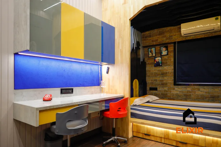
The Elixir portfolio
Details worth a closer look